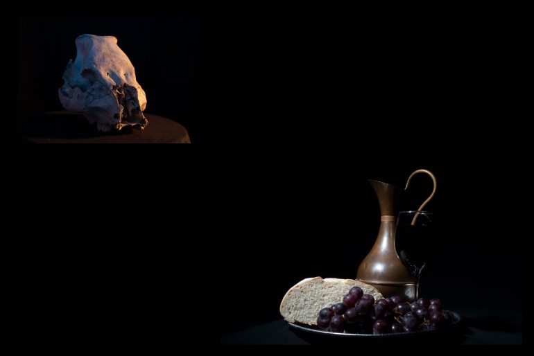
As I’m moving towards compiling my Work In Progress Portfolio I have placed some consideration into the presentation of images both individually and with other images. My work this module has moved in two veins; single specimen studies and compiled scenes which have symbolism. During my progress this module I have found the theoretical readings of Barthes and Szarkowski to be of particular interest with special attention given to Barthes’ theories on Syntax and the Concatenation of images. This, combined with some of the visual pairings created by Felicity McCabe, have lead to this post of experimentation. I decided to experiment with different positioning of images and differing background colours.
To help realign my inspirational links I’ve recreated a gallery of image combinations as found on my Felicity McCabe research page.

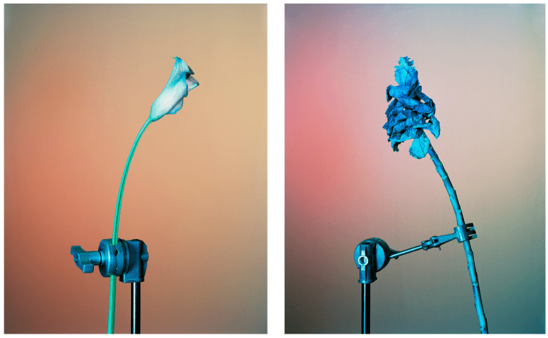
First I want to experiment with and display for this post some of the symbolic imagery created in this module. First with these diptychs below.

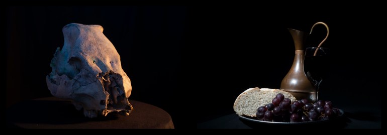
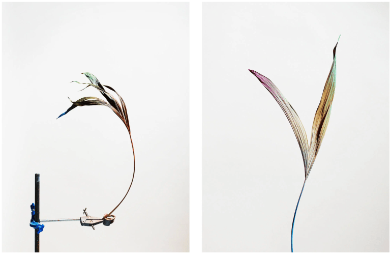
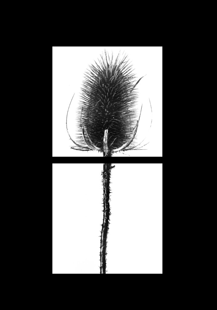
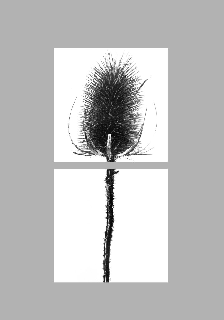
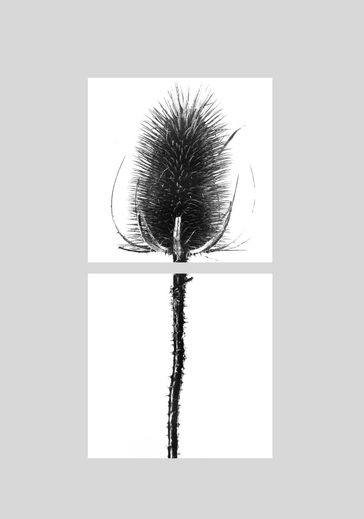
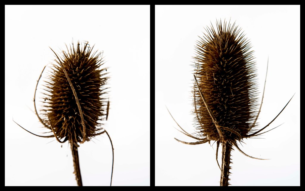
Starting with initially positioning images directly beside each other and with each image receiving the same presence in the frame. These have been quite successful and the black colouring is definitely more successful than White or either of the Grey samples. I took this a step further by using a larger canvas space and offsetting the images to each other both in position and size. These experiments are shown in the next gallery below.
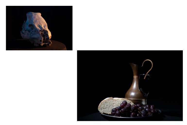
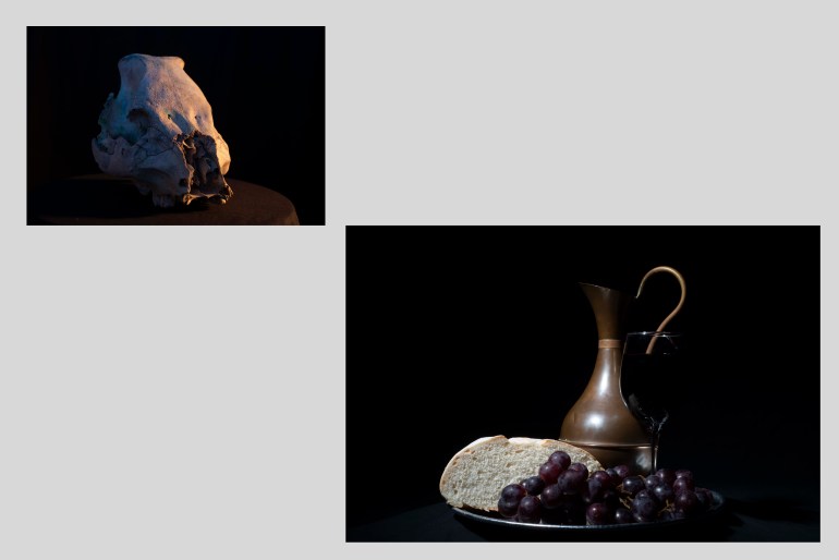
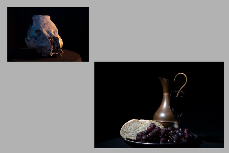
Here, as with before, the black is the more successful of the experiments. I prefer these offset diptychs to the equal diptychs from previously. The black used has been pure in the eyes of Photoshop with each of the RGB values being set to zero. This has proven the black created during shooting to be deep and successful.
Thistles have been quite an extensive subject matter during this module and so it’s important I give them attention of their own below. My experiments here have been extensive but more successful when working digitally than in film. The first gallery below shows where I have experimented with dissecting an example for display.
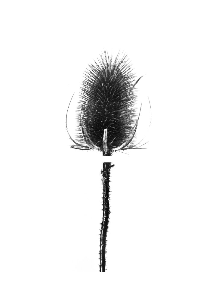
Here the white example, shown last, has been of the greatest success despite the unsuccessful image making in the first place.
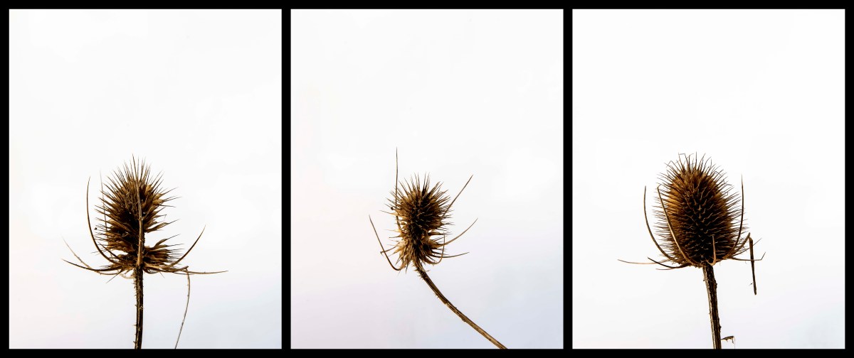
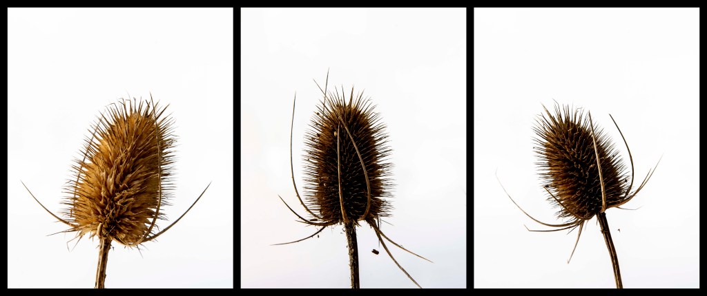
The next sets of gallery’s set out to display thistles in a panel form and using as equal framing and sizing as possible. At first I used the black and white edits however later felt that the colour edits had been successful also.


Initially my experiments set out the thistles in a 5×2 grid where the gutter between images was 20mm and I only used two tones of grey and black. I also experimented with these in a 10×1 row, still in black and white and still at the original ratio from when they were photographed.


These experiments had been quite successful but I still wasn’t sure about the background colours. I had been reluctant to use white as a background colour as these had been shot on white and I was concerned about losing the definition of the images edge. However, after consideration, I felt that this wasn’t as important as I had felt it to be. Furthermore the white achieved when photographing here had been less successful than its black equivalent as mentioned above. A return to these black and white edits with white background is shown below, both in 5×2 and 10×1.


From here I started to visit the colour properties of these images and found them to be of greater interest. My initial motivation for black and white photographing had been from the works of Irving Penn and Peter Lippmann. I however feel moving forward that the colour should not be ignored and have desire also to crop in tighter more similar to the works of Lippmann. A range of colour experiments are shown below and then discussed beneath them.

At this point I have decided to only include the images with the black backgrounds, I feel that these have been most successful here. This set consists of two triptychs and one diptych where no one thistle is used more than once. I feel that in this context and with this number of images the examples are shown more clearly and without over saturation of the subject matter. In a digital context the examples of 10 thistles on a concatenation is a bit overwhelming and has reduced impact than if they were to be printed. I may experiment with printing this as an example in the coming weeks. This largely depends upon my access to the appropriate printed in the current climate of coronavirus.
The next sets of concatenations focus on the images of Aloe Vera yet to feature on this page. I feel that many of these combinations are ‘qwerkier’ and more in line with the experimentations seen from Felicity McCabe.
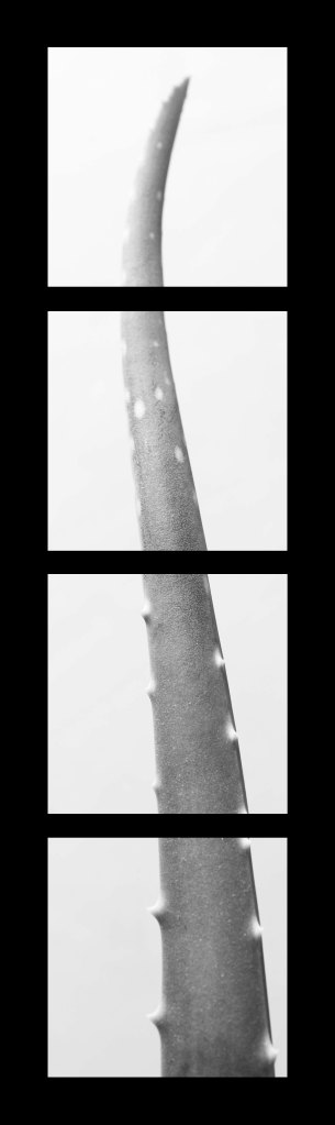
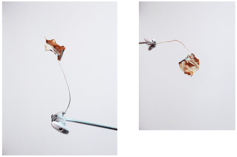
As with a previous example of a thistle, I dissected this specimen of Aloe Vera, photographically speaking of course. I do however feel that this example is not spiky enough for what I had in mind. The experiment has been a good process overall just I don’t feel this will make the cut in my WIPP.
For this experiment I decided to combine different images from the aloe vera shoot and lay them out roughly with where they ‘should’ be if reconstructing the plant as a whole. There was no preference around background quality or colour set here, this was in fitting with some of the research. Out of these the most successful, for me, is the experiment on a white background.
This doesn’t end experimentation like these and I may return to and add to this page at a later date. For the present moment it’s helping me with moving towards the selection process for the WIPP.
