Which adverts are the most successful?
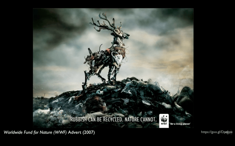
For me I feel that shock does still have an impact, particularly in environmental advertising. Therefore the most successful adverts here are those which shock such as the gallery shown below. These adverts are immediately accessible and require a reduced amount of reading. The text is generally minimal and imagery reduces our need to read deeper.


Which adverts are the least successful?
The least successful adverts here are a lot more conceptual and often require more reading. Their meaning is not always immediately clear and require the viewer to dive deeper. These have occasions where they are more successful and these are usually where your audience is more captive such as on a tube train during a dense commute.

How effective is the use of ‘shock tactics’?
Shock tactics are still effective however an overuse of them can often desensitise the viewer causing a distance between the reality and the cause.
How do aesthetics influence our response?
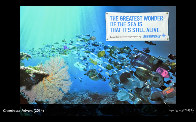
For me personally the aesthetic of an image is critical. If an advert is given too much of a ‘surreal’ manipulation, pushing it further from he reality it is trying to represent, I become cynical and ignore the message. The Greenpeace advert below with a ‘school of rubbish’ is an example of this. Where an image moves past reality and towards the obviously fake.
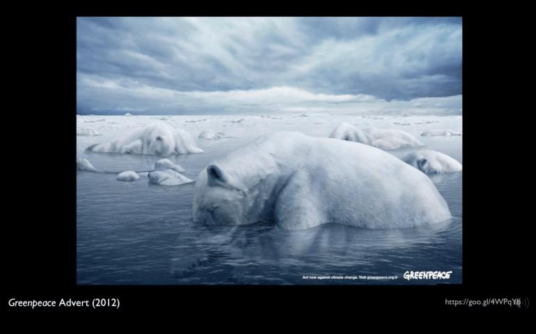
On the other side of this, the Greenpeace icebergs image, also shown below, has a greater impact on me. The subtlety of the image displayed and the discovery upon closer inspection that all of the ‘icebergs’ are in fact polar bears causes a greater impact.
How does text operate with the images?
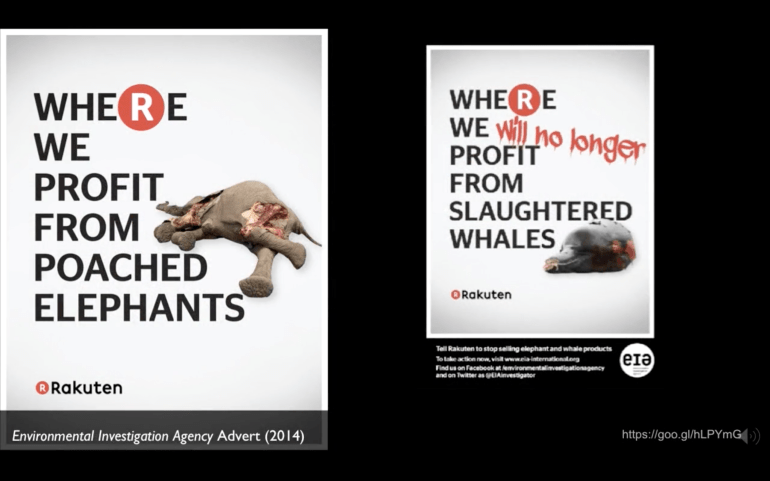
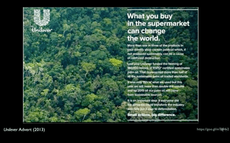
The range of adverts shown in this weeks presentation contain a varying degree of text usage. The first example below is the striking and unavoidable use of bloke lettering with recognisable branding elements in the Rakuten boycott campaign. This is greatly contrasted with the extensive use of type in full prose found in the Unilever campaign. The third example below is that of the subtle yet present ‘if you don’t pick it up they will’ found at the foot of the Endangered Wildlife Trust advert.
Context is everything. The Unilever campaign most likely appeared in printed press form in magazines and newspapers where the viewer is more likely to give it the time to consume the content. This approach would be much less successful on a roadside billboard whereas the other two examples below would be quite at home next to a motorway or a bus stop.
Are there implications for your practice?
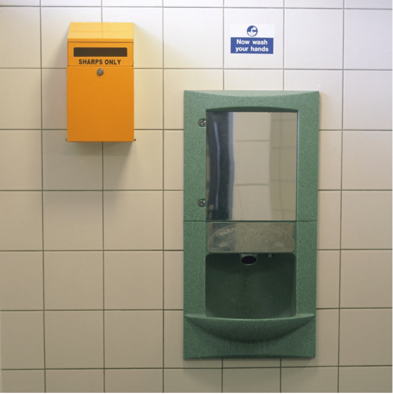
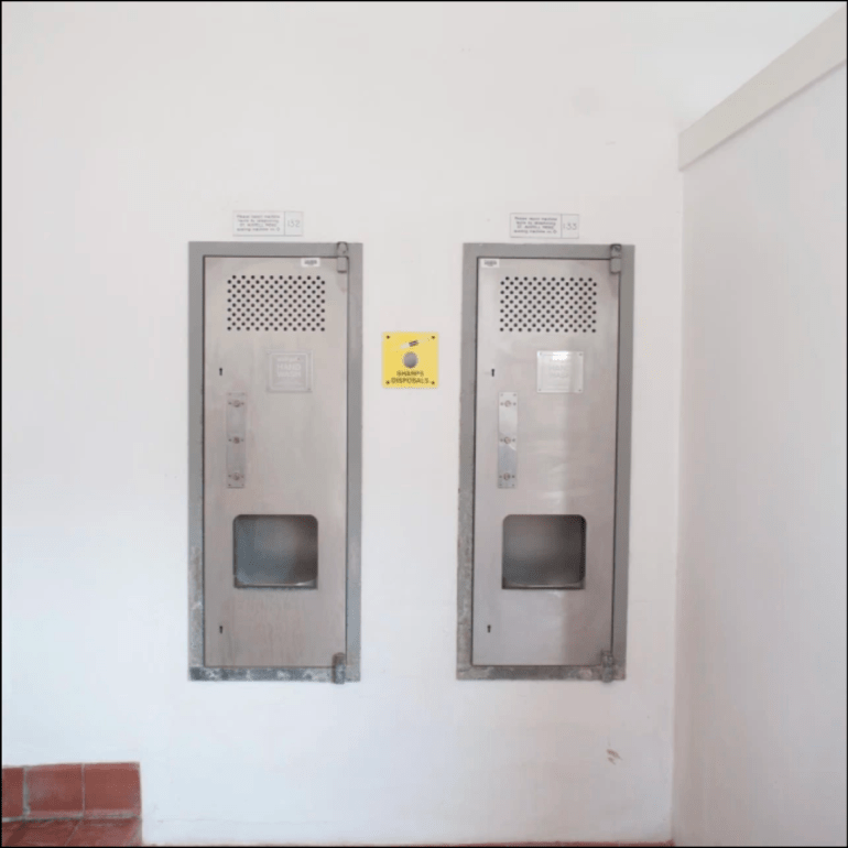
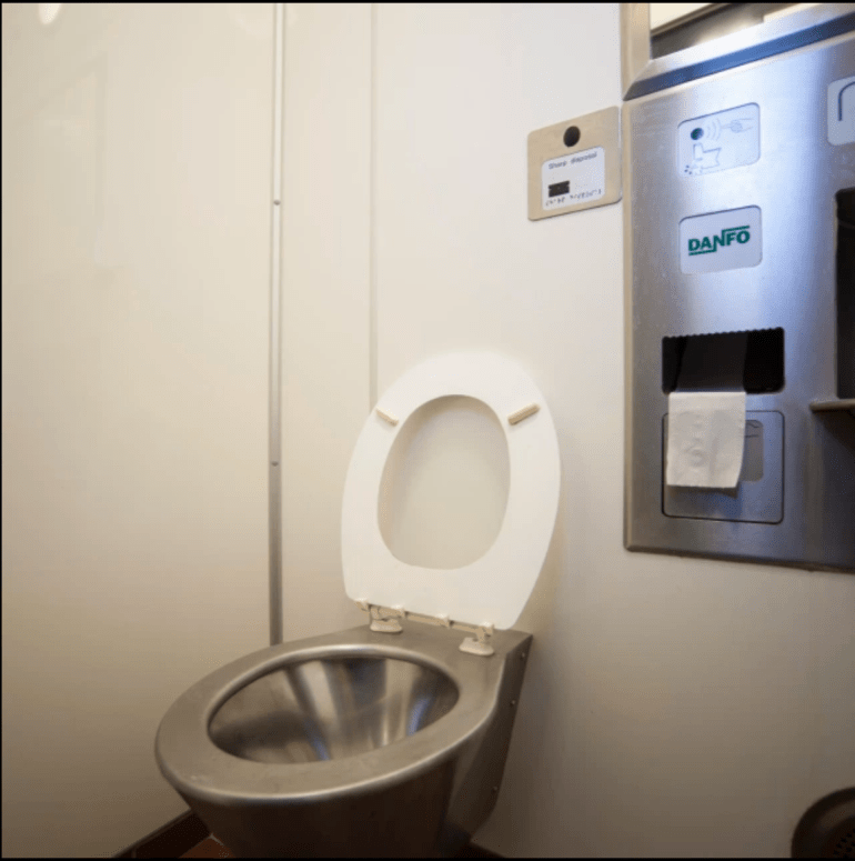
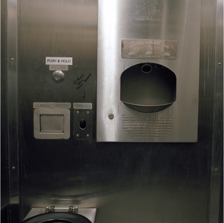
As a consideration of over saturation and desentisation I’d like to present the below set of images. They were taken over a period of years and I’m still adding to them as more examples are found. They are all hypodermic disposal points found in public toilets where the presence and requirement for such a facility effects the viewers consideration of it. There is a very real risk that, as the series grows, any potential issue becomes diluted in the number of images on display.